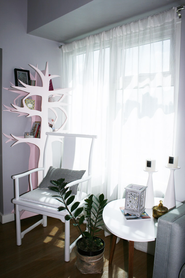
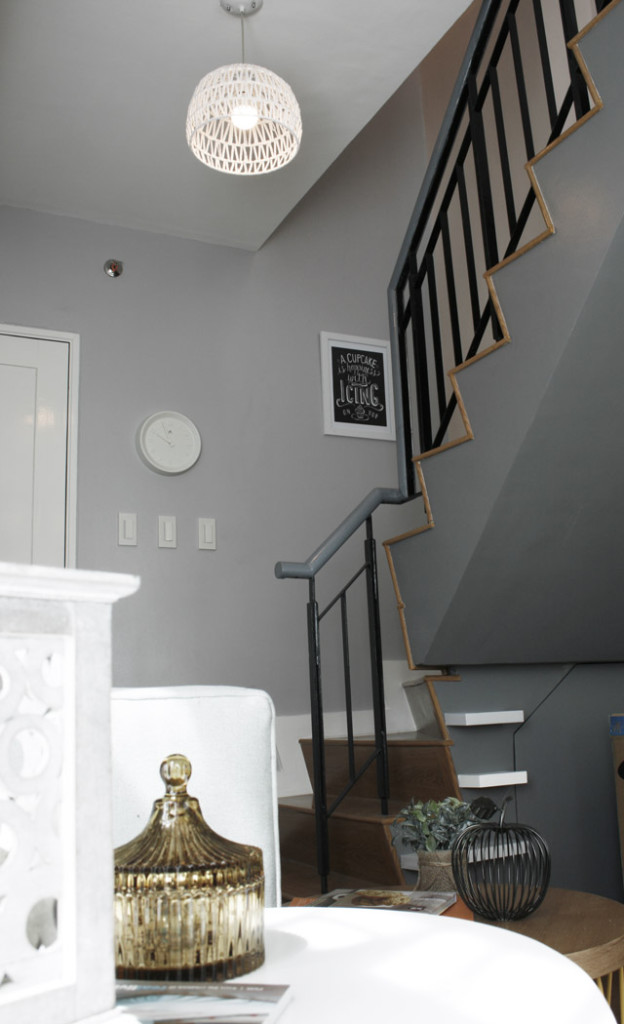
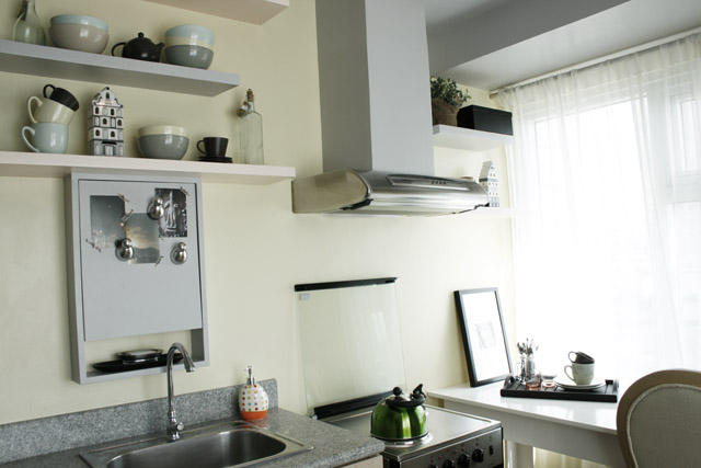
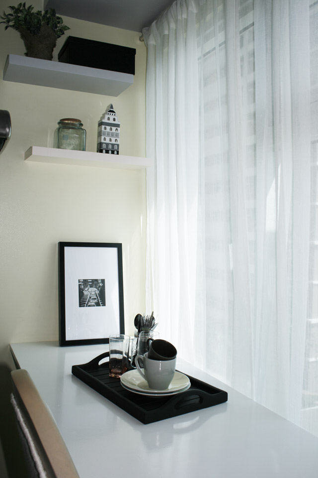
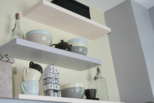
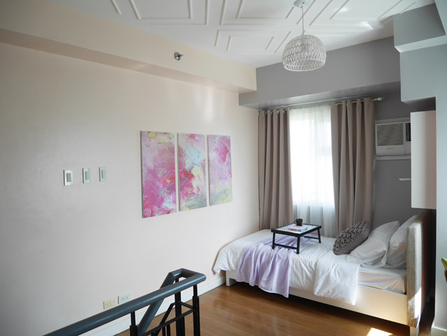
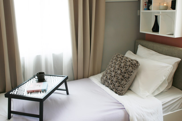
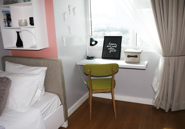
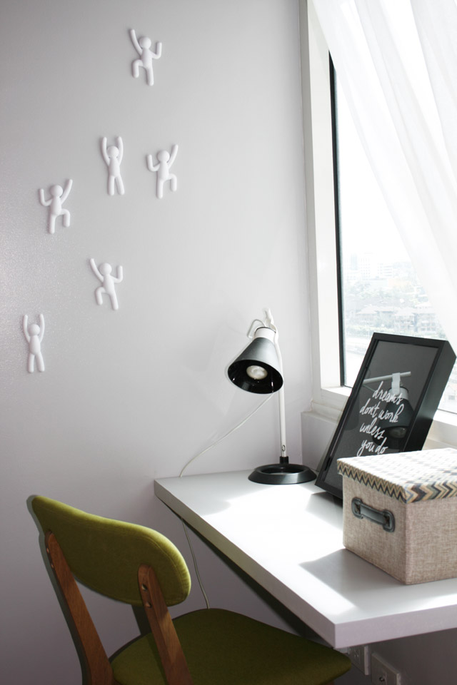
If most of you have noticed my Instagram feed, I’ve been posting photos of a design project which I call #eyecandy. I imagined a playful pastel palette and composed my presentation board around this concept but at the end I went for pastel with touches of black. I think the contrast worked well and I was glad to find a lot of budget accessories from SM department store and Our Home. This project took a year before materializing. I made the boards and started meeting with Robinsons Land in 2013 and didn’t get this first project until one year later. God really has His own perfect timing. I kind of lost momentum and was no where ready to start once I saw the email telling me to begin the model unit but everything worked out fine.
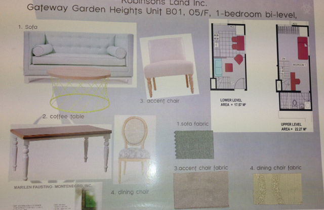
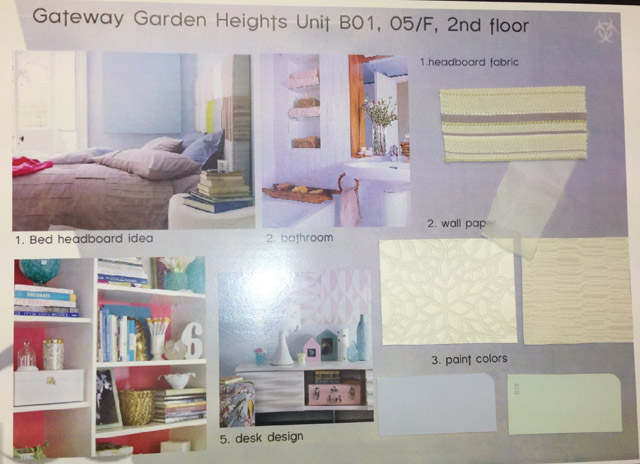
I had to prepare concept boards which was initially screened by the architect of Robinsons Land that got in touch with me. Then I had to present the same boards to the big boss of Robinsons too. A couple of site visits and furniture design sketches later, the model unit was ready to be styled.
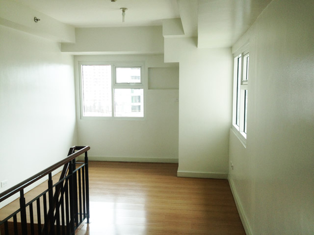
Here is a photo of what the unit looked like before. Walls were really uneven and a lot of things had to be repaired.
I wish there were more things I could do but when you are limited with a budget, it all comes down to just picking quality decor and accessories if you can’t do much construction and expensive changes. I hope you like project #eyecandy.
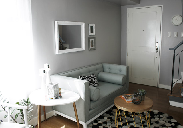

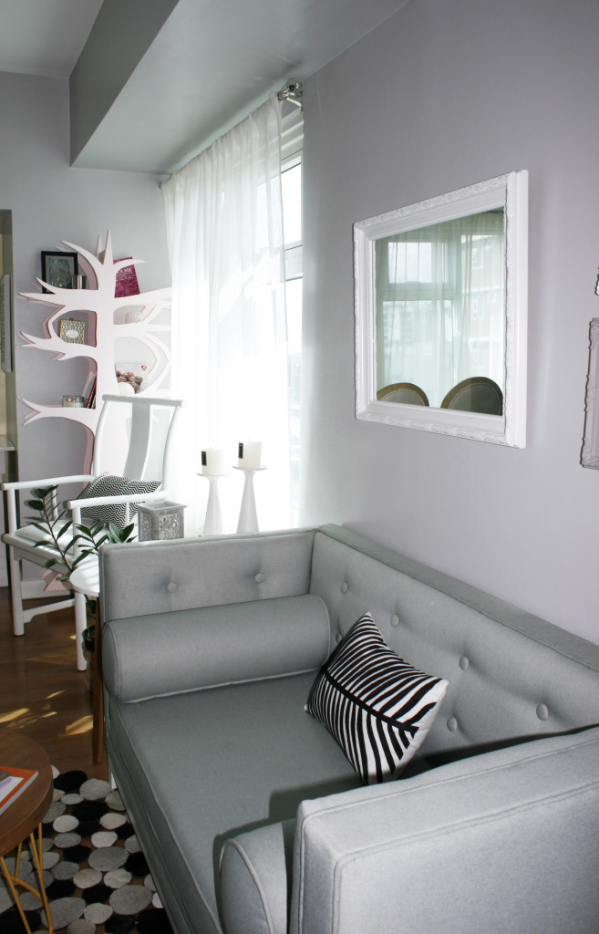
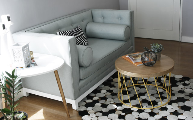
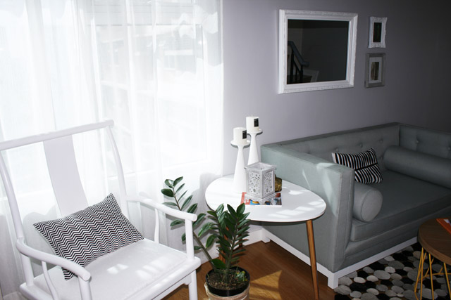

Marilen, this is so pretty! I love the soft palette, and the little details you added to make it feel cozy but really elegant at the same time. Not an easy feat!
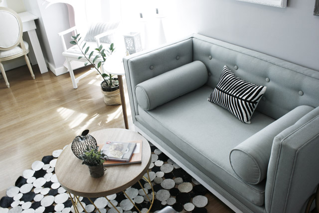
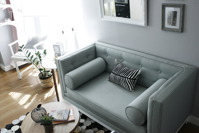
And I am so in love with the sofa! Where did you get it and does it come in a full-sized (3-seater) version?
Hello Pat! Thanks and I am really happy you like this. I had the sofa custom made. I can help you get in touch with my supplier if you want:)
I fell in love with the 2nd floor layout. Amazing use of space!
Thank you Sassy! There were very little options because the place was so small. Glad you liked it