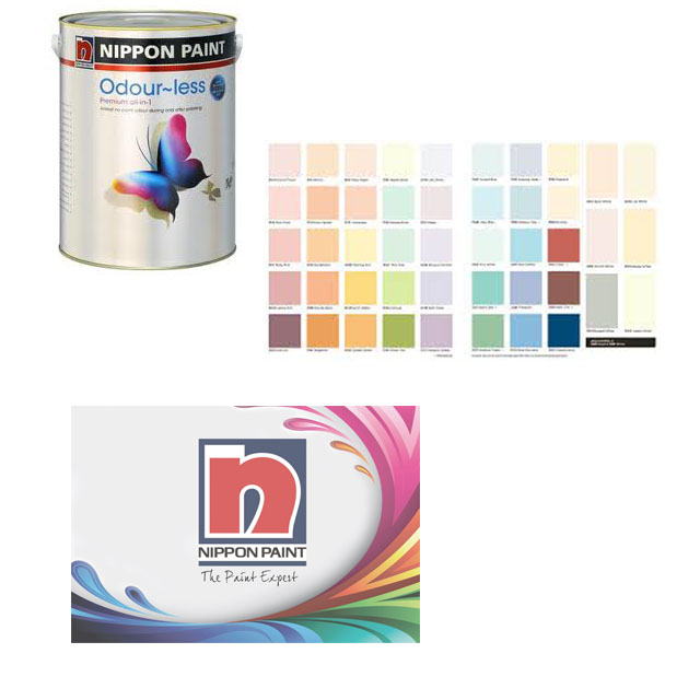
Did you know that color affects a whole list of things from feelings and emotions to one’s health and even the sales and success of a product? I had the chance to attend a seminar about color by Nippon Paint, once of the largest leading paint brands in Asia. The talk on color was given by color expert, Serene Pang who is Director of sales and marketing for the Duha Group, manufacturer of color marketing tools and color systems. It was good to know that Nippon Paint now offers a wide range of paint for interiors. I used to recognize it as an automobile paint brand, but was surprised to see they carry many different variants. I was particularly interested in their odour-less and green paint variants that reduce formaldehyde from the air.
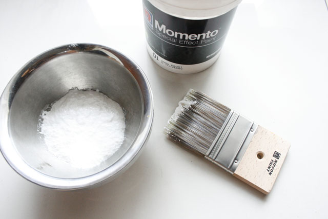
Another paint variant that caught my attention was Momento which is actually textured paint that is so easy to apply, leaving your walls with an interesting wall paper like textured finish.
I learned new things about color and how it can affect one’s mood and the feel and look of interiors. Here is a quick run down on what I learned:
Color is Important Because:
- It is the reason for purchase 85% of the time.
- It gains readership for a site or product by 80%
- It increases payment response by 60%
- Improves brand recognition by 80%
Given that color is so important we need to know how it affects marketing, branding and space. Here are some colors and adjectives that represent them:
Red is fast, passionate, warm, it increases heart beat and produces adrenaline. Red is often used by fast food restaurants. Red plus yellow pushes people to buy. That is why most SALE posters are executed in red. It also represent opulence and an expensive feel such as the red used in jewelry boxes and opera theatres.
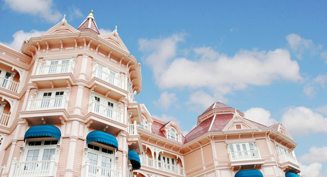
Pink slows the heart rate, reduces aggression and stress, it is innocent, feminine and promotes relaxation.
Yellow is the brightest hue, it is sunny, optimistic and cheerful. It spurs communication and improves memory. Interestingly it caused fatigue when used in excess.
Green speaks of nature, it is balanced, soothing and stable. It is good to use for institutional and low activity spaces. Deep green is upscale and lowers blood pressure.
Blue is a color for CEOs and corporations. It is a color of loyalty, peace and trust. Blue also suppresses appetite. Can you think of a restaurant with a blue logo ? Not many I believe.
Violet has the shortest wavelength it evokes spiritual connectivity, calms hyperactivity, and reduces stress. Violet is also a very upscale and elegant color depicting royalty.
Brown is down to earth, rustic, organic and neutral. It promotes harmony with other colors.
The next time you think about branding or using color for your space, consider these important facts on color psychology.
Sponsored by: Nippon Paint

Leave a Reply